Showing posts with label Stencils. Show all posts

Monday, August 17, 2015

Club Scrap: Woven Threads: Team Project using Stencils

Good Morning!  I am so excited to share this kit.  Every card I have made with the stamps and stencils in this kit has been a winner.  I love anything Celtic and my color choices: gold, dark blue, light green, pewter, and silver, remind me of those beautiful manuscripts of that long ago era.  The Celtic knots are timeless.

Card 1:  Stenciled design with Stamped Sentiment
The team challenge was to use Club Scrap  stencils in our designs.  I chose two, the Celtic knot and a fern.  Come along and see what I came up with!!
Card Set 2  

ClubScrap
Card 3: Embossed and Textured


Card 1:  Clean and Simple

I started by laying out the Celtic Knot stencil onto the white paper provided in my kit, and sprayed it with Heidi Swapp's Gold spray. 

There was considerable amount of paint glistening on top of my stencil,  I just could not waste it.   I placed a black paper over the stencil and transferred the excess paint to the black paper.

Black Paper over Stencil 
Transferred Design.  Nice!!!


Design being trimmed
After drying, I cut down the white/gold stenciled image to card size, stamped my sentiment in Versafine black onxy and mounted it onto a black mat and white card base.  Elegant and simple.

Card 2:  Still Clean and Simple, with a little more details.

Next I decided to try the same technique with the fern stencil.  I used a water color paper, Canson 140# cold press, as I was imagining that I would be adding water color to the background.  This was not necessary and regular card-stock would have worked fine:
Same process, apply stencil, and mist. 

First spraying, stencil removed and now placed on a new paper with the Paint side down.  
   I repeated this process for a second set.   Now armed with 4 images, 2 positive and 2 negative, I prepared to protect the fern image.  Masking is an option, but I decided to try Ranger Microglaze.


 I covered the leaves on all four prints and buffed in the paste. 

On one set, I used a stencil and the microglaze to add texture to the background.
  Time to add color to the background.  The first set, I splattered with Heidi Swapp.
Paint  was added by opening the bottle, removing the spritzing apparatus and flicking paint onto the image, blotting ink off of the microglazed areas.  
Finished Splatters
 
Final Spray with Radiant Raine for a little more Glimmer,  Done!


 On the second set, I used Distress sprays and stain to add color.  You can see how the MicroGlaze acted as a resist.


All were mounted onto a mat and then onto a white card base and embellished with either ribbon or gold thread.  Not bad, a set of note cards, that look like they go together.  Artsy!

Set one: Gold Thread and a little bobble completes the Card.  

Set two:  Green Satin ribbon and a bobble on these Resist Textured Cards.  


Card 3:

I decided to up the complexity a bit for my third card.  I used water color paper again.  This time however, it was because I needed  the thickness of the paper as well as the absorbency  I was going to be adding a lot of media to this paper and needed it to hold up to the challenge.

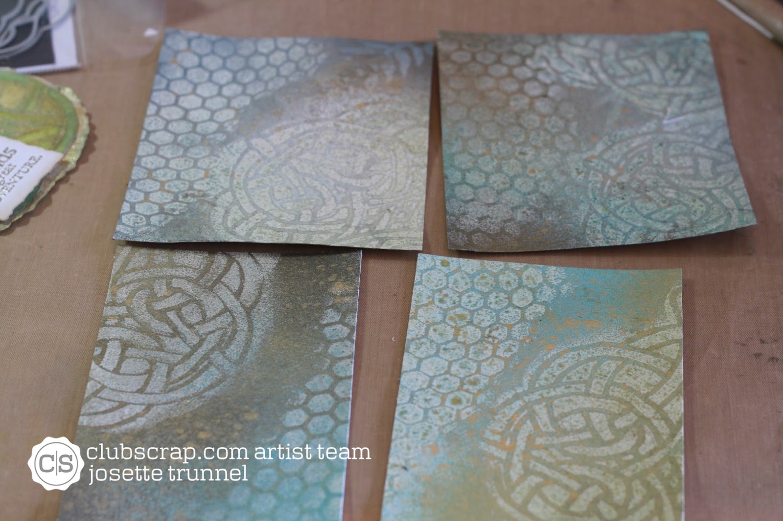
First, using Distress embossing ink, sponged the ink onto the paper over the stencil.  I then added clear embossing powder and heat set.  Repeated with the other stencil. 
I had done several experiments with different embossing inks in the past. (See posting of June 2, 2015 for details).    I chose to use Distress as it is thicker and leaves a more "raised appearance to the embossing", also the coverage is easier to obtain not as "solid" coverage allowing the inks to give a more distressed appearance,

They were sprayed with Heidi Swapp sprays, again, just for consistency.  


Sprays and spraying complete.
4 backgrounds.  All slightly different, but same technique.

Next, I used Ranger Texture paste and a strip of water color paper, to create a textured image of the Celtic knot.

texture paste and stencils.  
First I textured the stencil that was more circular in nature (this was used on the card wtih saying) and the second where the knot was more linear (Bliss Card).  Thus creating 2 separate images from the same stencil.
These were dried and then painted with Distress Re-inkers mixed with water and Distress stain, tarnished brass.  After painting, they were fussy cut into their final dimensions, paying attention to the pattern


I also painted a doily with the Tarnished Brass Stain. Lastly a spritz with Radiant Raine: Gold Pearl.  This was cut and molded into a mat for the rounded texture piece.

Aclose up of background used in Final Card

Sentiments were stamped and embossed: Ranger Platunum for the saying and celtic knot and Ranger clear embossing powder for the word "Bliss".


All were layered with fun foam and mounted onto a card base.


Whew that was a lot of crafting and a whole lot of thinking.  But I think they came out wonderfully.  Hope you enjoy!!

Which one is your favorite.  Leave a comment below.  Also tell me what you like, or don't and tell me what techniques you would like to see.


Also, be sure to visit Club Scrap to see more of this August Release: Woven Strands:  club Scrap

Links:
Stencils used:  FERN
http://www.clubscrapshop.com/store/p/3985-Twin-Tags-Masking-Stencil-Fern.aspx#.Vbu_PJNViko

Honeycomb and Circles: Twin-Tags-CirclesStenci

Celtic Knot Stencil: Woven-Strands-Lite-Celtic-Knot-Masking-Stencil

All stamps  were from the August: Woven Strand Collection:  Woven-Strands-Collection-Unmounted-Rubber

Paper:       White and Blue Paper: Woven Strands Collection: Club Scrap
                  Black and Gold  Paper:  Bazzil
                  Water Color Paper: Canson 140# Cold Press
Ink:            Distress Embossing Ink, Versafine Black Onxy,
Distress:    Stains:  Fossalized Amber, Barn Red, Broken China, Peeled Paint, Tarnished Brass
                  Re-Inkers:  Stormy Sky, Faded Jeans
                  Sprays:  Fossalized Amber, Barn Red,
Heidi
Swapp:      Sprays:  Gold, Navy, Cerise

ColourArte:    Radiant Raine:  Gold Pearl

Ranger:       MicroGlaze, Platinum Fine Detail Embossing Powder, Clear Embossing Powder

Adhesive:  Scor-Tape,  Tape Runner: scotch 3M, Glossy Accents
Misc:         Fun foam, dimensional foam squares and tape, ribbon, DMC Gold Thread

Visit again Soon
Happy Crafting
Josette

Tuesday, June 2, 2015

Backgrounds, backgrounds and experimentation

It has been a busy week.  Ready for an update?

Multi layered Grunge Card
As you know I am a design team member for Flossy Scrapper.  My role is mixed media.  Well, what does that mean.  To me it means, canvas and layer and more layers, using different media.  How to apply that concept to cards?  This my first dilemma.   This required me to redefine what Mixed Media means to me and perhaps to a larger audience.  So I spent the week searching web sites and viewing different types of art, paper crafting, Art Journaling,  After much reserarch I concluded that mixed media is technically layering, texture and color.  All this must be readable and in the case of a card on a small scale. Possibly mail able?

Insight!
I have made those cards!  I called  this grunge but I was using the same concept,  layer, texture, and color. but I defined it differently.  So what I needed to do, was define a mixed media style that was not grunge?  But how. . . . . . . well, play. Truth is the only way to define a new style or explore a media, is to simply play with it.  So today I am going to share my process and examine the results.
A simple Mixed media "grunge card"

Mixed media canvas
The process:
1) Oh where do I start?  Well paper is a good guess.  I decided to try 3 types, an 80# card stock, a #110 card stock, both in white and a cold press water color paper (140# Canson).  These were all cut down to a 4.25"X 5.5" (A2) size.  I made 3 stacks.  All were going to receive the same treatment.

2) Texture:  Decided to start with embossing: both with texture paste and heat embossed.
3) application:  stencil, stamps, direct application (just smear it on).
So, on each of the 3 card stocks, I first used a stencil and daubed embossing ink on to the card-stock using an ink blending tool.  I used several different stencils, and 2 inks:  Versamark and Ranger Distress and then applied a clear (regular grain size) embossing powder and heat set.  Conclusion:  Distress is Thicker and the result was there is a   "more organic" impression.  The Versamark retained more of the fine detail of the image.  This was better for stamping or when I needed a cleaner image, but when I just wanted texture the Distress proved better.  This became more apparent as I added the color.  No appreciable difference between papers.

This photo shows several examples.  All of these were created using the distress ink.  All were colored using sprays. 

Next was to try the same with stamping.  I simple used one of the 2 inks on each of the papers and stamped a background.  Repeated with the second ink.  Here the answer was clear, use the veramark, as Distress blurs the stamped image.  

Last step was to go back to the stencils and apply texture paste.  I used the same paste as in the video "A latte for you" Ranger, texture paste and applied to each of the 2 card-stock papers.  I did not apply to Watercolor paper.

4) coloring  This was the most enlightening.  The 80# did not hold up well and was quickly abandoned, This left  me with only the 110# card-stock and the Water color paper.   I chose a limited palette: Distress: Abandoned Coral, Cracked Pistachio, Fossilized Amber, and Walnut stain.  I used: stain, reinkers, and ink pads.  For the sprays: Distress but I used only the new colors (no Walnut Stain).  I also used: Heidi Swapp: Gold, Bronze, Cherry, Chartreuse, and Orange. Decided to limit it to a single manufacturer, but in the end added Dylusions in a beautiful yellow I did not have a yellow in  Heidi Swapp spray.  First,  I started with the ranger sprays.  Much to my surprise they were pale and almost pastel, on the card-stock and only slightly more colorful on the water color paper. Made sense as they start out diluted, but I was still surprised.   So I quickly moved onto the inks and re-inkers.  This gave me the more vibrant colors I was after and clearly the water color paper showed the best result.  Here are 2 examples of these:  These also demonstrate the difference in the embossing.  The first is with Versamark on Watercolor paper.  The Second, Ranger Distress embossing on Card-stock.
The first is cleaner and more vibrant, the second more rough and organic.  Both nice but different.  In person the difference is more apparent.
This has been stamped with Stampers Anonymous Fresh Brewed Blueprints mini on the background and on the insert.
The stamping here is from the larger Fresh Brewed Blue print and was colored with water colored pencils to keep with the more "pastel nature of the background.  The background is a combination of a coffee stencil and Tim Holtz Star Stencils. 

I then switched to the other sprays,  First sprayed the embossed papers, they are represented in the very first photo and then moved onto plain paper, both 110# and water color.   In the end the samples all had a softer, mistier feel from the metallic layering. When I left out the metallic or used a very minimal spritz, the color was more vibrant, but not as interesting.  Generally, in this exercise  I had used both the gold and bronze on the same papers.  Wish I had stuck to more color and less metal, but 2 of the backgrounds ended up as cards and they both were more "metallized".  Decision: perhaps one manufacture is not best the best for variety.  Less metal if want bolder colors, paper choice little difference other than the color difference and texture between the papers.  I  preferred the card stock, probably because it was white. 
Time to make cards and stop experimenting:

I still had some embossed samples left over.  So I attacked these with my preferred "media" (re-inkers and pads) but switched up the color to Mowed Lawn and Broken China.  

The hexagon stencil had spoken  to me from the beginning, and I had an idea to use them with a Bird Theme.  Thus, I had embossed several of these, hoping to have a few with the right color combinations.  None of the experiments fit the bill, but I had 2 left .  These were going to become the background for those Crazy Birds by Tim Holtz.  Both were on water color paper with Distress embossing ink and heat embossing regular clear powder. They were  colored with re-reinkers that had been applied to a craft sheet and spritzed with water. Careful placing gave me a sky and grassy area..  I had came up with this idea because they have the look of  chicken wire.

Mowed Lawn and Broken China reinkers, colored with Water Colors (tube type)

Full version.  The birds were matted and popped up and then attached to a blue note card

Similar background, but very "little grass", so I created a Barnyard effect.  This bird was colored with Copics.


As you noticed I did not include my experiments with the texture paste.  There was little sampling necessary as I had used the paste and Distress products on the canvas.  I planned on using the texture paste panel to explore using mixed media  in an elegant, antiqued style.  That style will include a video.  I am most happy with vintage, understated elegance and METAL!!!    So, until next time,
Happy Crafting,
Josette