Monday, August 17, 2015

Club Scrap: Woven Threads: Team Project using Stencils

Good Morning!  I am so excited to share this kit.  Every card I have made with the stamps and stencils in this kit has been a winner.  I love anything Celtic and my color choices: gold, dark blue, light green, pewter, and silver, remind me of those beautiful manuscripts of that long ago era.  The Celtic knots are timeless.

Card 1:  Stenciled design with Stamped Sentiment
The team challenge was to use Club Scrap  stencils in our designs.  I chose two, the Celtic knot and a fern.  Come along and see what I came up with!!
Card Set 2  

ClubScrap
Card 3: Embossed and Textured


Card 1:  Clean and Simple

I started by laying out the Celtic Knot stencil onto the white paper provided in my kit, and sprayed it with Heidi Swapp's Gold spray. 

There was considerable amount of paint glistening on top of my stencil,  I just could not waste it.   I placed a black paper over the stencil and transferred the excess paint to the black paper.

Black Paper over Stencil 
Transferred Design.  Nice!!!


Design being trimmed
After drying, I cut down the white/gold stenciled image to card size, stamped my sentiment in Versafine black onxy and mounted it onto a black mat and white card base.  Elegant and simple.

Card 2:  Still Clean and Simple, with a little more details.

Next I decided to try the same technique with the fern stencil.  I used a water color paper, Canson 140# cold press, as I was imagining that I would be adding water color to the background.  This was not necessary and regular card-stock would have worked fine:
Same process, apply stencil, and mist. 

First spraying, stencil removed and now placed on a new paper with the Paint side down.  
   I repeated this process for a second set.   Now armed with 4 images, 2 positive and 2 negative, I prepared to protect the fern image.  Masking is an option, but I decided to try Ranger Microglaze.


 I covered the leaves on all four prints and buffed in the paste. 

On one set, I used a stencil and the microglaze to add texture to the background.
  Time to add color to the background.  The first set, I splattered with Heidi Swapp.
Paint  was added by opening the bottle, removing the spritzing apparatus and flicking paint onto the image, blotting ink off of the microglazed areas.  
Finished Splatters
 
Final Spray with Radiant Raine for a little more Glimmer,  Done!


 On the second set, I used Distress sprays and stain to add color.  You can see how the MicroGlaze acted as a resist.


All were mounted onto a mat and then onto a white card base and embellished with either ribbon or gold thread.  Not bad, a set of note cards, that look like they go together.  Artsy!

Set one: Gold Thread and a little bobble completes the Card.  

Set two:  Green Satin ribbon and a bobble on these Resist Textured Cards.  


Card 3:

I decided to up the complexity a bit for my third card.  I used water color paper again.  This time however, it was because I needed  the thickness of the paper as well as the absorbency  I was going to be adding a lot of media to this paper and needed it to hold up to the challenge.

First, using Distress embossing ink, sponged the ink onto the paper over the stencil.  I then added clear embossing powder and heat set.  Repeated with the other stencil. 
I had done several experiments with different embossing inks in the past. (See posting of June 2, 2015 for details).    I chose to use Distress as it is thicker and leaves a more "raised appearance to the embossing", also the coverage is easier to obtain not as "solid" coverage allowing the inks to give a more distressed appearance,

They were sprayed with Heidi Swapp sprays, again, just for consistency.  


Sprays and spraying complete.
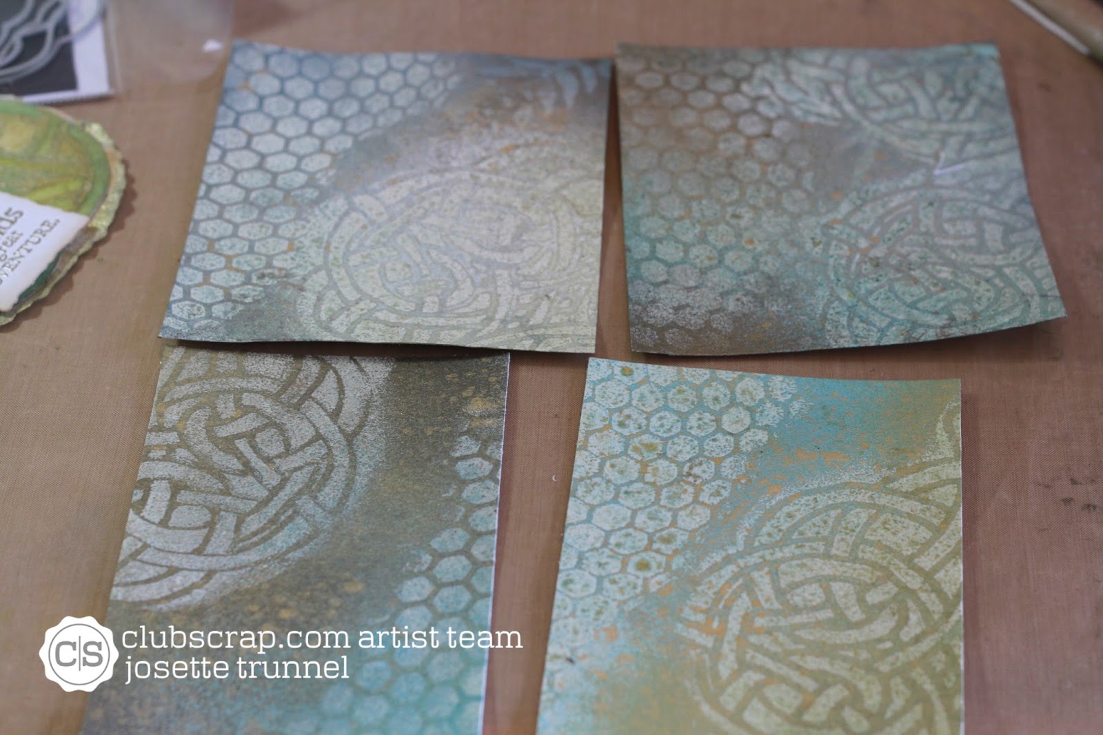
4 backgrounds.  All slightly different, but same technique.

Next, I used Ranger Texture paste and a strip of water color paper, to create a textured image of the Celtic knot.

texture paste and stencils.  
First I textured the stencil that was more circular in nature (this was used on the card wtih saying) and the second where the knot was more linear (Bliss Card).  Thus creating 2 separate images from the same stencil.
These were dried and then painted with Distress Re-inkers mixed with water and Distress stain, tarnished brass.  After painting, they were fussy cut into their final dimensions, paying attention to the pattern


I also painted a doily with the Tarnished Brass Stain. Lastly a spritz with Radiant Raine: Gold Pearl.  This was cut and molded into a mat for the rounded texture piece.

Aclose up of background used in Final Card

Sentiments were stamped and embossed: Ranger Platunum for the saying and celtic knot and Ranger clear embossing powder for the word "Bliss".


All were layered with fun foam and mounted onto a card base.


Whew that was a lot of crafting and a whole lot of thinking.  But I think they came out wonderfully.  Hope you enjoy!!

Which one is your favorite.  Leave a comment below.  Also tell me what you like, or don't and tell me what techniques you would like to see.


Also, be sure to visit Club Scrap to see more of this August Release: Woven Strands:  club Scrap

Links:
Stencils used:  FERN
http://www.clubscrapshop.com/store/p/3985-Twin-Tags-Masking-Stencil-Fern.aspx#.Vbu_PJNViko

Honeycomb and Circles: Twin-Tags-CirclesStenci

Celtic Knot Stencil: Woven-Strands-Lite-Celtic-Knot-Masking-Stencil

All stamps  were from the August: Woven Strand Collection:  Woven-Strands-Collection-Unmounted-Rubber

Paper:       White and Blue Paper: Woven Strands Collection: Club Scrap
                  Black and Gold  Paper:  Bazzil
                  Water Color Paper: Canson 140# Cold Press
Ink:            Distress Embossing Ink, Versafine Black Onxy,
Distress:    Stains:  Fossalized Amber, Barn Red, Broken China, Peeled Paint, Tarnished Brass
                  Re-Inkers:  Stormy Sky, Faded Jeans
                  Sprays:  Fossalized Amber, Barn Red,
Heidi
Swapp:      Sprays:  Gold, Navy, Cerise

ColourArte:    Radiant Raine:  Gold Pearl

Ranger:       MicroGlaze, Platinum Fine Detail Embossing Powder, Clear Embossing Powder

Adhesive:  Scor-Tape,  Tape Runner: scotch 3M, Glossy Accents
Misc:         Fun foam, dimensional foam squares and tape, ribbon, DMC Gold Thread

Visit again Soon
Happy Crafting
Josette

Wednesday, August 12, 2015

Club Scrap: How to foil a Celtic knot?

Reverse Foiling on Black

Curious?

It is a play on words because this process was a challenge to get
right.


Once I did, it was easy! Come along as I share the process.


Stamping and Preparation to Foil


First I needed to stamp in a circle.  There was a perfect stamp in the kit.  I started by trimming the rubber very close to the impression area.  Carefully removed all the excess rubber around the stamp   ( I needed it to bend).  Applied a layer of  mounting glue. I used the mounting glue from Club Scrap. Amazing hold.  The holding power allowed me to curve the stamp and it stayed through several hours of "playing".
Club Scrap - Mount It Adhesive 2 oz. #1072


I used a template to determine the size of circle I would need and how many times to stamp the image.  There is a great video and downloadable templates on Maureen Wong's site:  http://mycasestudies.blogspot.com/2015/02/misti-templates.html

After completing the stamping, gaps remain.  

Filled in gaps with .3 black Multi-liner Marker
Colored with Copics:  RV 66 and YG 23 were used to color the knot.  Layered onto green and plum card stock.  Stamped area was blended with Distress Ink: Twisted Citron.  I used a Circle dies to cut the circles.  


Evaluation and started again


It worked but not what I was after. So, I restamped ( I had not removed my stamp, so knew that I could just repeat my stamping).  This time, instead of finishing the knots, I scanned it into my computer and finished the knots by using Adobe Illustrator a vectoring program.   After I completed the image,  I filled the area in with black using Photoshop.  Note:  This could all be done with pen and paper too. Just ink in the knots like in the first example and  then color in with black marker and scan. I did not think of that until much later, (darn).   
Printed on a laser printer.  Also printed a toner sheet.  

A file for the toner sheet is available at Jennifer Mcquire's site:  http://www.jennifermcguireink.com/images/2015/04/Toner-Paper.pdfFoil Time

Foil Time

I wanted the image to be gold foil with black knots. I needed the reverse of my printed sheet.  So, I started with the printed image and using a laminator or the Minc, whichever you have, ran the printed image image through the machine with gold foil.  Carefully removed the foil.  Now I have a gold knot on white paper.
First run: white with gold. Note foil in foreground with missing foil in knot area.  

Negative foil laying over black toner sheet.                                                                                                            

Using the foil that was missing in the "knot area" I  placed it on the toner-paper sheet. This was cut down to just a little smaller than the foil.  Ran this through the laminator again, and viola!! Black knots on a gold background.

Creating the cards:  

Both cards were prepped similarly.  Choosing a circle die slightly bigger than the outside of the knots, both were die cut.  For the white card, I also cut out the center. 

 Card one:  White with Gold foil, Shaker Card

 .
 For the white one, I cut out the center using a circle die.


 I cut fun foam to cover the outer circle using slightly smaller/bigger dies, layering a piece of acetate between them.  The foam foam was covered with scor-tape


 The Center Piece was sprayed with Heidi Swap Gold spray.  I used this as it leaves blobs of gold rather than a fine mist.  I wanted the drops.  (Not sure if this is a property of the product or delivery failure, but when I want "drops and blobs" I use this spray.  May need to buy a new one and see if it works the same!!)  You could get the same results by taking off the lid and flicking the paint onto the card.  After dry,  I stamped the sentiment and then glued it onto the front of a 5x5 square card.  Sequins and other glitter was placed in the center of the center circle and the "ring" fitted over the center creating a shaker card.

Black card and Gold: 

This was actually the easiest of the two.  I love shaker cards but they do take awhile to get everything lined up and put together.
This card is also a 5X5 square card base out of black.  The foiled piece was layered on top without any dimension.  I stamped an image onto black and heat embossed with gold Ranger Fine Detail embossing powder.  This was then fussy cut out, placed on a slightly smaller circle of fun foam and layered on to the center of the card.  The white center was done the same way as the white based foiled knot.  The image was stamped onto white paper with black ink and scanned into my computer.  During the scanning I placed a box around the image and greyed out the area in the box very slightly.  Printed it using a laser printer.  The foiling attached to the fine grey printing and gave a speckled appearance.  The image was fussy cut and layered onto the center of the card, giving a medallion appearance to the card.

Here are some additional views of the cards.


All of these stamps are from the August Club Scrap Selection:  Woven Strands.  To learn more about Club Scrap visit there web site at:  http://clubscrap.com/


Supplies:

Stamps:  Club Scrap Woven Strands: August Selection
Other supplies used: 
Mount-It- mounting glue for rubber stamps, Club Scrap. 
Brother HL-L2320D Laser Printer
Heidi Swapp: Minc Laminator, Gold spray paint
DecoArt: Gold foil
Ranger Fine Detail Gold Embossing Powder
Versafine Ink
Distress Ink: Twisted Citron
White and Black Paper (Neenah Solar White Bazzil Black)
Green and Plum Paper from Club Scrap
Copic: multiliner in .3mm, RV66 and YG23
Fun Foam, Scor-tape for adhesive
Assorted Sequins
Circle Dies from Sizzix
Piece of acetate for center of shaker
Don't forget to visit on Little Bits and Josette Trunnell andClub Scrap on Facebook.

Happy Crafting
Josettehttps://www.facebook.com/LittlebitsbyJosette

Sunday, August 2, 2015

Another Announcement: I am also a designer for Club Scrap

The good news keeps coming!!!  Nearly the same time that I found out about ColourArte, I was notified of another great opportunity, Club Scrap.

I had applied to both because I thought it would be a winning combination.  One provided media, paint and shimmer, the other everything else: stamps. paper and design elements that I would need to turn into a finished project.  I have the tools (ColourArte) and current stamps and paper (Club Scrap).  YEA!!!!

I worried that my "stuff" was outdated or at least not current.  I have no idea who manufactured what when it comes to stamps and paper.  I always have removed the packaging and tucked them into my organizational system.  So as I started to develop my ideas and goals, one problem surfaced: "how was I to link to products that I had no idea where they came from".   Buy new, well I could but I am not very "trendy" and what if I chose wrong.

I have been following Hetty Sanders, first through Michael Strong stamps and then Club Scrap.  So when the call for a Club Scrap Design Artist came up, I jumped.  

So starting in September I will be present projects for these two amazing companies.  One as a blogger and the other as a videographer.  I will be documenting my progress through the world of paper crafting and mixed media.

So I am going to provide you with a little eye candy, a hint of what is to come.

Happy Crafting
Josette
Birthday wish with copies

Thursday, July 30, 2015

I am Officially on the Design Team for ColourArte!!!

Today is a wonderful day!!  I get to tell everyone about some exiting news.  I have known for awhile but was sworn to secrecy.  During my knowing and not telling, I have been in the frenzy of preparing to meet this new project with full steam.

How did I come to be here!!  Well most of you know my saga.  I left Washington State last year, closing my medical practice of almost 20 years, a place where I had grown to love all my patients, I had aged with them and watched them grow into adults with families. Overtime, I had said goodbye to many as well.   I was going to leave family and friends, a place where I had raised my children a small community where I had grown as a person.  The choice to leave was hard.  But I needed to forge ahead and help my daughter recover and rehab from her illness, so she could have a life.  So to Texas I went.  Roxanne secured a spot on the USA ParaEquestrian Team and I went back to work in a small clinic with no hospital call or On-Call requirements.
Roxie and my Husband.  We were in France for the 2015 World Equestrian Games.  Her smile says it all.  

With only a 40 hour work week, I figured I had time to craft more often.  Not just dabble, but really delve into crafting.  Thus, I set my goals on being a member of a design team.  But. "was I good enough".  Self doubt is often our worse enemy, I decided that I just needed to jump in.  I needed to define who I was and how I would best fit in to this crafting community.  I made cards, played with different styles and products to develop "my look" that would help me to begin my journey.   Then one day I saw it:  CALL FOR COLOURARTE team designers.  Perfect!!! I had used their products for years and dearly love my Twinkling H20's and Radiant Rain.

So here I am, an official member of the ColourArte Design Team.  I am hoping you will join me and my fellow designers as we explore the world of ColourArte.

Some important Links:
Link to the Posting by ColourArte announcing the Design Teams:  visit and read about this amazing team of designers, both for the blog and video;   http://www.colourarte.com/blog/?p=3516#close


Hash Tags:
Twinkling H20’s, - #TwinklingH20's # shimmeringwatercolors
Silks Acrylic Glaze - #SilkAcrylicGlaze  #mixedmediaglazing
Radiant Rains - #RadiantRains #hybridwatercolors
Primary Elements Artist Pigments - #PrimaryElementsArtistPigments
Radiant Gels: #radaintgels #dimensional paint


My YouTube Channel:  https://www.youtube.com/channel/UCw4xKy9i8Y9ZeQ8zH7EX_0w
This blog : http://josettetrunnell.blogspot.come
Facebook: https://www.facebook.com/josette.trunnell
Crafting Facebook page:  https://www.facebook.com/LittlebitsbyJosette

 Here is a little taste of what is to come.


Join me as I share my exploration of Twinkling H20's and other ColourArte products.  I will be sharing and crafting with these amazing products. I am scheduled for the second and fourth Saturday of every month on my YouTube Channel for crafting tips and design ideas with ColourArte
Happy Crafting!
Josette

Sunday, July 5, 2015

ColourArte Design Team Project


I am so excited to share my project that was completed for ColourArte.
The project I will be sharing is a simple card using Twinkling H2o and Radiant Rain Shimmering Mist.  A fairly simple project, but with a twist on a few of the techniques.  I paired these fabulous products with Tim Holtz Distress and Ranger Embossing powders and Inks.  I think the final result is Magical.   Visit ColourArte to learn more about the shimmering products that were used on this card.
http://www.colourarte.com

A  Shimmering confection in blues


So, how did I create this card.  I first applied via direct application Ink to Cold press Water Color paper (140# Canson).  This was then stamped using a background stamp that was inked with Distress Stain in Burnished Brass and then misted with Radiant Rain.


A clock stamp is inked and embossed with Fine Gold Embossing Powder and then colored using Twinkling H20 in Mustard Seed, Meridian, and Pearl Red.


A panel of Water Color Paper was inked with several distress Inks: Chipped Sapphire , Faded Jeans, And Stormy sky.  After Drying was embossed using a clock embossing folder by Sixxiz.  The ribbon was inked similarly by adding ink to the craft sheet and absorbing the ink into the ribbon that had been spritzed with Radiant Rain.
The final step was to fussy cut the clock, emboss the watercolor paper and a gold foil card stock, layer onto a card base and add the embellishments.  

Here is a close up of the details.  


I thoughtfully enjoyed making this card.  There is a You Tube Video Available that shows the entire process.  
Be Sure and visit ColorArt for all your shimmering Creations.  
https://youtu.be/IU54X_azaDs
Thank you 
Josette


Monday, June 29, 2015

4th of July Inspiration and a Dialogue about Creative Spark..

Well, I am back.  Time flies when you are having fun!!  June has been full of all sorts of activity.  First, my daughter had a major horse show in California.  Preparation to getting her ready is always time consuming. She and my husband flew and the horses were ground shipped so everything had to be accounted for and checked and rechecked to make sure all arrived in a timely manner.  I unfortunately was unable to go.  I stayed home to root from Texas.   During their week long absence, my sister came to visit.   My sister, Alicia, is an amazing paper-crafter.  When we visit each other, the hostess teaches one new technique and then we make cards with that concept.  What I learn is that I am very much inside of my own box. I craft alone except when she visits.  I need inspiration from outside to keep me motivated to create new and different.
This visit, I was the hostess, so I planned on continuing with my background/mixed media experimentation.   While I like layers and complexity, she prefers more "controlled" organized simple concepts.  Magic happens when we meet up.  I have an opportunity to explore a different path with the same tools.  I often come away with a new focus, or an appreciation for something I maybe thought of but discounted, or an entirely new idea.  Today's cards are the result of our weekend.  The final card was mailed to Alicia from me for the 4th of July, but it is truly a combined inspiration.

So, lets start with the background.  We used all the same techniques as I had shared with my blog post regarding background experimentation.  Only this time, I used the ink pads applied onto an acrylic block and then placed over, a slightly dampened piece of water color paper. This allowed for more control and the ability to see where the ink was going.  We had the idea to make a distressed "flag" background.

The basic Background
So to recap, I used a Tim Holtz stencil, stars.  Sponged distress embossing ink over the stencil and embossed with clear embossing powder.  On an acrylic block applied Fired Brick and Mermaid Lagoon, spritzed with water and then applied the inked block to water colored paper that had been misted with water.  The ink bled under the embossed stars giving a rustic appearance.  There is a lighter area in the center, this was where there was no ink.  For the next step, I used the same ink, with an ink blending tool and evened out the inking and thus covering up the white area without having to worry about "messing" up the perfect areas.  I also applied Walnut Stain around the edges to enhance those darker edges where the red met the blue.  They look brown in this photo but were more of a dark purple.

We made a stack of backgrounds of various colors and techniques.  These will be turned into cards at a later date.  But my first task was to create a card from just one of the backgrounds.  At home, missing my sister, and thrown into "normal life", I seemed to lack inspiration. Thus the time lag.  

 I pulled stamps and colored, played and made a mess.  Even stopped to "organize" my organized stamps once more.  The problem was that  I  just could not see how what I had in the way of stamps would work with this background.  Part of the issue was that this background was rustic.  Almost Cowboy rustic, old and tattered, not what I usually make, more bright and happy.  Everything I tried was too "modern" or stylized. That furry bear with drums and pipes, too cute, the skyline too modern, but what?   So back to the cowboy thing.  Well,I do live in Texas, and there is no lack of inspiration for "this look", but it was too expected.  But how and what could tie all that together?
The inspiration hit like a hammer.  The idea of "Easy Rider"came flooding into my head. This is a movie from before time, I think, well 1969 to be exact.  A movie with Jack Nicholson and Peter Fonda.  It is a motorcycle saga, reminiscent of those old cowboy movies.  Only instead of horses they used motorcycles and the cowboys were not outlaws in "the cowboy sense, but drug dealers.  The formula was the same as the old Westerns, only time and circumstance being different.   The characters were outlaws from conventional society,  they had rejected the established norms and were being hunted by the law. This new "western" created quite a stir and soon movie goers and society realized that motorcycles could be a legitimate American art form, and the term Ironhorse was born.  

Sounds good!! Well, actually the rest of the story is that I suddenly remembered having 
the perfect stamp!!   Snoopy, the dog from Peanuts the comic strip, riding on a Harley !  If I backed him by an American Flag (artisitic license here),  it could be seen as rather rustic and patriotic at the same time. That Harley is sure outdated and Snoopy is well, old.   He first appeared in print in October of 1950, and was one of the main protagonist of the strip.  I think he might have been the inspiration for Easy Rider, LOL.     

How perfect!!!  So the card became.   I am not sure that anyone else will see that spark of inspiration, that set me on this path of creativity.  It often is those little things that start us on our way.  That little bit of inspiration, a little spark, a little glimmer or a fond memory that leads to a flood of creativity.  


My point in discussing the inspiration for this card,  is to show that when we sit down to create that spark has to come from somewhere.  It is present in everything we create. Even when try to recreate  someone else's  work, it will have a distinct difference because of what we bring to the table from our skill set and our past experiences.  Truly, I did not think of "Easy Rider"  with all the analytical comparison between modern day "cowboys" and  the old time Western Cowboys, but I was looking for that "cowboy edge".   My inspiration was  that movie, with it's motorcycle genre, coupled with the knowledge that I had a Snoopy Stamp on a Motorcycle that led to this design.  I will admit that the George Patton Movie scene showing him giving a speech in front of an American Flag did flit across my mind, but that is another topic altogether.
So enough about inspiration.  How did I make this card.  Well I had the back ground completed.  So, Snoopy was stamped onto Neenah Solar White card stock in Memento Tuxedo black and colored with Copics.  The image was enhanced with a silver Gel pen and Wink of Stella added to the glimmer.  I die cut stars from glitter paper and adhered them onto the back ground.  
Close up of the Sparklers.  This was very hard to capture with a photo, but the idea is there.  
Now all I needed was fireworks.  These too  were a spark of inspiration.  I started with circles  I had cut circles from white  card stock and stamped a flower image that "sort of looked like sparks with versamark and then heat embossed with a glittery embossing powder.  Not quite right!  The circle of white made them look like UFO's.   So I repeated this  process on Velum and then cut away any excess paper to give the image of fireworks. The center was colored with a grey copic and then Silver Wink of Stella added on top of the entire image followed by clear Wink of Stella.  The result was a multiple level of sparkle. Subtle at some point and stronger in other areas.  The center was dark enough to hide the glue and foam dot that was needed to give them dimension.  A simple greeting, then layered  the card front onto silver card stock and then popped it onto a  bright blue note card.   Not bad!!!  I need to go watch that movie again, it has been awhile!!  I bet Jack Nicholson and Peter Fonda haven't aged a bit, but I have!!!
Until, next time,
Happy crafting.  Josette