Saturday, November 14, 2015

ColourArte Video Time: Reverse Stenciling, Butterfly Shadow Box

It is time for another project for ColourArte.  I love backgrounds.  If I could just make backgrounds I would be happy.  Backgrounds however, are nothing without the rest of the story.  So lets discuss the background as well as the finished piece.  This project's technique is how to Reverse Stencil with ColourArte Silks.
The Background
As with all techniques, there is a learning curve to get the right combination of products.  I tried stenciling first and then coloring the background.  While it worked, it lacked the depth of this example.  I tried various products as well.  Silks gave me the softest and most distinct image transfer.
Here are a few of the backgrounds that were created during my exploration of this technique:
This is the stencil using Radiant Gels and is done in the traditional stenciling manner.  Note the "gears" are the white space.  If you want the opposite from your stencil, this technique fits the bill.  I tried reversing this stencil, it worked but the finished product had a lot of texture but no distinct image.  Might work better with a different stencil.  This one had a lot of "plastic" to cover.
Another example, this one is using Silks and is reversed Stenciled in the same manner as demonstrated in the video.  Not bad, will use if for another project later.  To "bold for this project.  
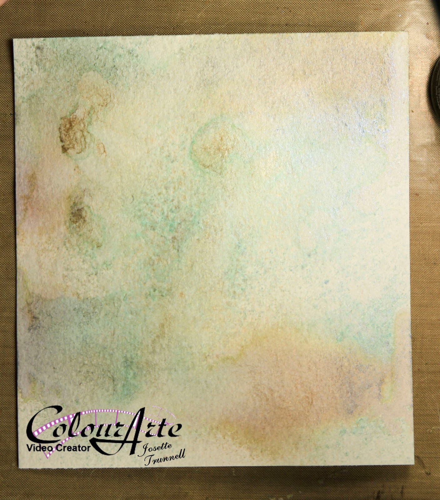
Background prior to stenciling.  This was Water Color paper misted with a mixture of water and Primary elements.  I went with less concentration of color to give a soft background with areas of more intensity.
After I finished the background the challenge was to find a way to use it, so let see what I came up with.
The background supports the focal images without being overwhelming.
The flowers were misted and daubed with several Radiant Rain Products and Primary Elements.  

The ribbon was created by spraying and daubing Radiant Rain products as well as the same sprays used on the background to create a harmonious composition on Seam Binding.
Beginning of ribbon coloring.  Once the ink is laid down, water is added and then the ribbon is kneaded to blend and distribute the colorant.  I appears very bright and bold here, but once dried, matched the background very well.

The very back, background was made by spritzing the Primary Element spray through a texture plate by Gina Designs.
The ink was blotted up to give a faded distressed feel.  This wasn't necessary as most of it was covered with the focal background.  But is a good technique to use for another project.  
The most rewarding part of this project were these butterflies.  I had received a sample of Embossing Powders from Sweet Stamp.  I was playing with them when the idea came to me to include them over the background.  I was going to add gears and metal to make a steampunk project, but the idea of adding the butterflies to the gear background seemed right, Organic meets natural.  But I needed them to match my project.  I did not have any powder that matched.  After much thought decided to create my own.

I combined:  embossing powder fine detail, with chunky. Glitter, both fine micro glitter and Distress.  Distress Embossing Powder, Glittered Embossing Powder, plus some of the samples that I had received from Sweet Stamps.

Once embossed, they were further enhanced with the Emperor's Gold Silk and Radiant Rain Sprays.

Final step was to distress the background and apply ink to the edges and enhance the colors within the background.  I find that Distress Ink goes with everything!!
Distressed and ready for ink.  Tumbled Glass and Walnut Stain Distress.
Final product!!  Beautiful.

Link to YouTube: Watch the process

Hope you enjoy!!
Until Next time, Happy Crafting
Josette

Links:
Colour Arte:  http://colourarte.com
YouTube: ColourArte Channel

Supplies:
ColourArte
Radiant Rain:            Egyptian Gold Dauber
                                  Nutmeg Spray
                                  Guatemalan Dauber
                                  Teal Zircon Spray
Primary Elements:    Beach-House Blue
                                  Ancient Coin
                                  Burnt Umber
Silks:                         Emperor's Gold
                                  Olive Vine

Other Products used:
Strathmore 400 Series, Cold Press Water Color Paper, 140#
Distress Ink;            Tumbled Glass
                                Walnut Stain
Dies:                        Sizzix: Movers and Shapers butterflies , and Large Butterfly
Sweet Stamp:          Enchanted Aubergine Embossing Powder
                                Mermaid's Tears Embossing Powder
                                Piccolo Enamel/Embossing Powder adhesive

Products used to create embossing Powder mix:
Sparkle and Sprinkle: Opaque:  Candlelight and Mediterranean Star
Tsukineko:    Verdigris
Distsress embossing powder:       Walnut Stain
Distress Glitter:  Tarnished Brass
                            Peeled Paint
                            Peacock Feathers
Hero Arts:  Clear
Stamendous: Aged Gold, Aged White,


Friday, November 13, 2015

Club Scrap Technique Challenge: Club Scrap

The challenge this month was to use Water Color Pencils and color an image.  Well this stamp said Tile and birthday.  So this is what I cam up.  Stunning I say!!!

Lets see how I made it:

I started with the stamp on Water Color Paper.  My favorite paper is Strathmore 400 series in 140# Cold Press.  A bit thicker and definitely more thirsty than some, but I find it doesn't buckle as much and holds up to a ton of water.  First stamped in a grey archival ink and then  I colored the image with my Derwent Watercolor pencils.  After all the coloring was finished, I used a water brush to activate the pencil and move the color around.  Adding more as needed to created shading.  
After activating with water.  I could not resist embellishing this image.  So I doodled around the edges and on the stamp itself.  Then added Wink of Stella in Clear to give it just a hint of shine.
This was cut to size and matted on Purple and Gold Cardstock.  The purple is from Moroccan Spice Kit, the gold is a Core'dination card stock.

The rest is easy.  The card measures 5 X 7 "  So a card base of that size was cut out of the Red Paper from Moroccan Spice.  A mat was cut out of the Purple and Gold paper and measures: 4.75 X 6.75 "
A scrap piece from the background mat, was turned over, stamped and heat embossed with Gold Fine Detail Embossing Powder.  I added ribbons from the Kit, Done!!

Love this Card!!  Hope you do to.  Be sure and stop by Club Scrap Technique Posting and enter your project using this technique.


Happy Crafting,
Josette

Supplies:
Derwent Water Colors;
Imperial Purple 23
Crimson Lake 20
Deep Vermillion 14
Deep Cadmium 6
Prussian Blue 35
Lt. Violet 76
Blue Grey 68
Archival Grey Ink
Delicata Gold Ink
Ranger Fine Detail Embossing Powder: Gold
All paper and ribbon came from: Moroccan-Spice-12x12-Assorted-Paper-Pack

Monday, November 2, 2015

Sweet Stamp: A Walk in the Park, Part 2 of Copic Coloring.

Here we are ready for part 2 of my discussion regarding Copics.  I am a fan of using my paper to help me choose which markers are best.  When I use colors and the associated "logical" blending group, the image often will not go well with the paper once complete.  This process of choosing markers based on colors within the paper, seems to solve this issue.
So in Part 2,  I will show this process in action!

The Card
You Tube: Part2, The coloring.

This card is very straight forward.  The image was a digital from Sweet Stamps. Glam Girl Heather.
After re sizing in Photoshop, I printed it on my Canon Ink Jet printer.  Neenah Classic Crest, Solar White 80# is primarily what I used when coloring with copics.

Using the Paper, Sweet Lizzy, Lucky Charm by American Crafts, the Copic Markers were chosen.  The video shows this process.  Then the blending colors were added and the image colored.
Final step was to mount this onto an 5.5 inch by 5.5 inch White Card Base.  The seam tape was colored with the same Pink Copic markers, a perfect match.

A closer view of the Frenchie.  The coloring for this image was inspired by a photo of my own TigerLilly, right down to those pink ears.
For additional information and detail about this card, Visit Sweet Stamps Blog.

Happy Crafting:
Josette

Copics used:
B:   0000,37,39,45,91
BG:0000
R:   05,24,59
RV:32,93
G:  00,12
YG:11
Y:   13,15,35
T:    01
W:   0.01,03,05,07,09
110

Other supplies:
Wink of Stella, White Gel Pen, Black Gel Pen.
Versafine Onyx Black
Paper: Lucky Charm, Sweet Lizzy
Seam tape
Stamps and dies to complete the project.

Wednesday, October 28, 2015

*{CraftChaos}*: Club Scrap Big Top Blog Hop

*{CraftChaos}*: Club Scrap Big Top Blog Howonderful and ingenious as usual. You always inspire me

Club Scrap Blog Hop: Visiting the Big Top!

Welcome to the Blog Hop: you should have arrived her from  Lisa Dolezal  .  If you got lost along the way, you start at the beginning by clicking this link:  Club Scrap

Here we are with the final posting for this Month's Club Scrap Kit: October.  The theme this month is the Big Top.  If you have been following along, you will will note that this is a Vintage French Circus Theme.
One thing I wanted was more animals, I love circus Animals. So I decided that this is the perfect opportunity to add animals into my kit, share some images from my favorite illustrator and discuss Copic Markers.
Papers, Embellishments, Stamps (rubber) Club Scrap
Digital Images: Mo's Digital Pencil

Background:  

I have been using Copics longer than I have been paper Crafting.  My first exposure to these markers was as a way to color metal.  They are an alcohol based marker and will color and patina metal beautifully.  When I started to "play with paper" these were a natural choice to color my images.

But as with all new art forms, there is a steep learning curve.  My path with these markers has never been smooth.  There were paper choices, marker choices and what to color choices.  Some paper worked and some did not, so I turned to YouTube tried to learned how to use these markers on paper.  But the information was very conflicting.  The information available today was not present back then and it was Very Frustrating! Before I started paper crafting, I had taken my basic Copic certification, but I was working with metal and really did not pay close attention to the paper application.  So after many starts and stops, experimentation and frustration, I took a long weekend in Oregon and completed the intermediate certification from Marianne Walker.  She opened my eyes as to what was the possibility and potential of these markers.  I have been coloring happily for years now.  I would like to smooth the path for those wanting to explore these markers, or improve on how to choose and color with them.  To start: the first step is how to choose which markers to buy.  Second is Paper.

So, I would like to explore this fabulous kit and discuss Copics: choices and decisions.  I created a YouTube Video that outlines the use of the Hex Chart and choosing markers based on Paper choice.  This will help guide your choice in which markers you need.  Next posting will discuss Papers and why some use one type and others use another type.  For the most part, most Copic users turn to Neenah Solar White, Classic Crest.  This works 99.9% of the time and is a great way to start.  This is not the same paper you will find at a big box store.  This is a specialty paper and must be obtained from either a supplier for Print Shops or an online retailer that carries copics.  X-Press It and Copic Brand papers are another good option.  

Copic Selection Video

Card 1: The Monkey (Monkey Tricks)

I am going to start with this one because it is the most straight forward.  (The process discussed here was repeated for all the cards.  Paper, Markers, Photoshop, Print, color, assemble. ) I used a Canon Ink Jet Printer.  I have no issues with running ink from this brand.  My HP however, will run. When I use that printer, I heat set with my Heat Tool.  Again, test your printer, because the paper will make a difference.  

I started by finding my images.  I am a fan of Mo Manning and turned to her site for images of Circus Animals.  

I then laid out the papers and ribbon for the card.   The Green and orange papers, plus the ribbon and a brown card stock from a previous kit started me on my way.  

Hex Chart: Sandy Allnock
I placed the papers and ribbon onto the chart and found the Copic Marker that matched as close as possible.  Thus, 3 markers, a green, an orange and a brown were chosen.  From there, using the chart, I chose the rest of the markers to use for blending.  By doing this, I am assured that my finished image will match my papers and ribbon.   
The original 3 Markers:  YG05. YR05, E59, the rest were chosen from around those markers on the chart.
The image was pulled into Photoshop, sized and printed onto Neenah Solar White and colored using the Copic Markers.  The Sentiment was stamped, also on Neenah Solar White with Momento Ink in Tuxedo Black.  This was also colored with Copics and then the edges were inked with Vintage Photo Distress Ink.  Everything was die cut using a set of square dies from My Favorite Things, and the edges were inked on the green and orange square using Distress Ink: Mowed Lawn and Spiced Marmalade.

The brown just was too flat.  So I found a similar color of Coordinations, used a text embossing folder, dry embossed and sanded off the wording.  All were mounted onto a 5.5 X 5.5 card base with only the Monkey and Circus being popped up on Fun Foam.  A ribbon tied, corners punched out, and a pearl added to complete the picture.  Perfect!

Often somewhere in the design process, some changes are inevitable.  I just don't like having to go find a different paper group totally because my image no longer goes with the chosen papers!!

Card 2: The Mouse  (Cupcake Mouse)

I wanted something bright and cheerful.  I was intending on using the Clown Sentiment in the Kit and needed a clown image but not a Scary Clown.  The Quad papers and the pink ribbon seemed the perfect solution.  But the paper is very complex.  The mouse/clown needed to blend with all the varieties of color.  Once again the hex chart guided the way.

A lot of Markers!!!  But it worked.  The image appears to Belong !
After finishing the coloring, it was clear that unless I wanted a gigantic CARD, I needed something different for the Sentiment.  You can never go wrong with a Happy Birthday Card.  

So here is where we talk about ink.  I love Momento when I am going to color with copics.  I don't have to worry about running or fading, no matter how many layers or saturation of ink that I apply.  While some inks claim to be "Copic Friendly", with enough marker saturation, most will bleed or run.  Momento will not,  but, Momento is not a dark black ink either.  If I need a sentiment to stand out,  it needs to be bold and dark.  Thus if I am going to color the image with Copic's I need to protect the stamping from the alcohol ink.  Are you following me?  So, the easiest way to do this is to heat emboss.  Versa fine Onyx Black is the perfect sentiment stamping Ink, it is not a dye ink, will stay wet long enough to adhere the powder to and produces a crisp image, perfect for detail.   So, when I need dark and Copic together, clear embossing powder is the ticket.
Some may wonder why I just didn't emboss in Black Embossing powder.  The answer is in the detail!!
It is very hard to get a fine detail inking with versamark and if the embossing with black is not perfect, it will show up!  

This is a 5 X 7 card.  I glued the two quads together and cut the mat to size with them glued.  No worry about edges that just don't quite meet.  A bow was tied with the Pink Satin Ribbon. Image cut with a circle die and matted with a blue paper that matched the checkerboard print.  Sentiment was inked and embossed then colored with Copics and mounted onto the Pink Paper included in the kit.  
Close up of Mouse completed.  Note the vintage feel.  This was done by light coloring and then using a light grey marker to tone down the image in places.  Grey to ground the image also adds to the Vintage Feel.  Because the markers matched the papers, even adding grey to tone it down, doesn't interfere with the effect.

Card 3:  The Elephant  (I Heart You)

Lets start with the image.  It needed a vintage feel, and I needed it to match the kit.  And it needed to be different from the other two.  Elephants are grey, so I needed to think cooler colors to pull this off.  
Guess which papers I used!  The pink and the Green.  All the choices were based on the papers and ribbon choices just as before.  But the majority of the image is grey.
This is an A2 card.  White Base measures 4.25 X 5.5.  A Kraft mat was cut slightly smaller.  Both the image and green mat were cut with a rectangle die and the corners notched.  Green Pearls adorn the corners and Pink Ribbon finishes it.
The stamp for the sentiment was cut from the stamp.  One small area was masked.  If I had trimmed that area away, the stamp would not stamp as it had originally.  Thus I was able to get "2" stamps out of one.  
RV04 (pink) matches paper and YG03 (green) is perfect.  Grey  is the dominate color.  7 grey markers were used.  I chose the warm grey as this animal is alive and I used the cool grey to tone down the background. The yellowish colors and Blue are for the background and ground.  These were chosen as they balanced the image.


Hope you enjoyed this Posting and will stop back again.  On the first of November I will be back with  another video that will finish up our Copic Discussion.  That will be featured on my YouTube Channel and the card used for the video will be on Sweet Stamps Blog.

To Continue the hop, your Next stop is the amazing  Tricia Morris.  Be sure and leave comments along the way.

Happy Crafting,
Josette

Links:
Club Scrap
Copic Video

Supplies:
Big Top Kit
By Card:
Card 1:  Monkey Tricks Image
Green and Orange Paper from Kit, Brown from Co'rdinations (Ranger), Neenah Solar White.
Green Ribbon and Pearls from Kit
Inks:  Distress:  Mowed Lawn, Spiced Marmalade, Vintage Photo
          Momento:  Tuxedo Black
Pens:  Sakura Glaze in Black (for eyes).  White Gel Pen for light Reflex
Wink of Stella:  Clear, coated pants for a glimmer
Cuttlebug: Embossing Folder: Text
Copics:
YG:  03,05,07,17
E:     33,53,55,59,84,87,99
R:     20
Measurements:
Card: 5.5 X5.5 inches
Mat:  Brown:  5.25 X 5.25 inches
Orange square: 3.25 x 3.25 inches
Green square:  2.5 x 2.5 inches
sentiment and image: 2.75 x 2.75 invhrd

Card 2:  Cupcake Mouse Image
Papers:  Quad Prints, Neenah Solar White 80# image, 110# card base)
Ribbon: Big Top Kit
Inks:  Versafine:  Onyx Black
Embossing Powder:  Clear, Hero Arts
Wink of Stella: Clear and Silver for Pompom on hat.  Also used clear on fluff around neck
Stickles:  Christmas Red, embellishment on cupcake
Sakura: Glaze pen Black (eyes and nose), White Gel for highlights.
Copic: Multiliner black, .25 mm to add detail to mouse and whiskers
RV:    34,91,94
R:      20,59
V:      0000,000   (cupcake frosting)
E:      41,42,53,55 (cupcake wrapper and ground)
B:      0000,000,00,04,05,06,41,52
C:      00
T:      01,03,
W:    00,0,1,3,5  I used several greys, cool, tone, warm to created different "feels"  The mouse is primarily W.  C was used to tone down the pinks, and T became the ground.
Measurements:
Card:  5 x 7 inches
Mat: Quad prints:  6.75 x 4.75 inches
Circle: image:  3.75 inches
Circle Mat:       4 inches
Saying: 2.5 x 1.75 inches

Card 3:  I Heart You Image
Paper:  Pink and Green Card Stock from Kit.  Kraft: Neenah Desert Storm  White: Neenah Solor White, 110# for card base.
Ribbon: Pink from Kit
Pearls:  Green from Kit
Ink:  Versafine: Onyx Black
Embossing Powder, Hero Arts, Clear
Sakura: Black Glaze for Eyes and White Gel pen for highlights
Wink of Stella:  clear, Used on tutu, sentiment and balloon
Copics:
YG:   03,11
RV:   00,02,04
R:     20
B:    000,00
E:    51,53,55
W:   00,0,01,03,05,07
Card:  A2, 5.5 x 4.25 inches
Kraft:  4X 5.25 inches
Green 3.75 X 4.5 inches
Image: 3.5 X  4.25 Inches
Sentiment:  3 x 2 inches

Monday, October 26, 2015

Halloween Cards!!! With Those Crazy Birds!

I have not posted just for me in forever.  I am not a fan of Halloween as a holiday for a very personal reason, but I love Halloween Cards.  I know that sounds crazy, but it is what it is.
So, I made some Halloween cards and thought I would like to show them off.

Now I am just saying, I am in love with Tim Holtz Crazy Birds and these cards have those "Crazy Birds" front and center with assesories by Crazy Things.

Card one a "Witch Bird".

Let us start with the background.  This is a fun technique.  Distress reacts with water so I used that property to create the background.  I started with Brown Card Stock.  Inked a Map stamp by Hero Arts with Distress Stain in Antique Bronze stain and then sprayed with with a glimmer mist.  In this case I used ColourArte Radiant Rain in Pearl Gold.  The spray activates the ink, and then this was stamped onto the card stock.  The more water you add, the more "watery" the back ground will appear.
This technique works with a background that has been solidly inked with distress.

The Bird was stamped and cut out on Water Color Paper.  It was colored with Twinkling H20's, die cut and then glued down in layers.  The hat was colored with distress markers. and glued onto the head.  The Broom was glued under the wing.  I did cut off the legs to reposition them so they looked like they were moving backwards.
Closer view of WitchBird.  The sentiment was stamped in Brilliance Gold ink and them covered in Ranger Princes Gold embossing powder and heat set.  Cut out and popped up on 3d foam squares.
This is an A-2 top folding card.  Mat was cut from platinum paper and mounted onto a brown card base.  The image was directly mounted onto the mat.  The bird and image is all that is popped up.
Silver ribbon and an brad finished the look.

Card 2: RabbitChick
I used a left over background from a Club Scrap posting.  It was created with Distress ink and a stencil (September Blog Hop, Club Scrap, instructions for background).

The bird was colored with Twinkling H20 and glued together.  The Rabbit ears and pumpkin basket were also stamped, colored, fussy cut and glued into place with the aide of dimensional.  The area branch was free cut from brown paper and a green leaf glued on.  This was popped up on 3d foam.  A banner was stamped and attached to bottom.

Wondering how I created those Question Marks.  This is a great trick!!  I took Heidi Swap glitter tape that she uses for her Marque signs, and die cut it with a die from sizzix.  They have glue on the back, so I just stuck them down.  Fun!!    

Close up of the Rabbit chicken.  Note he has a string holding on the bonnet!! Cute.

The next card is one from the year before.  I love this card and reproduce it whenever, with many themes, but the Hearse is my Favorite.  Details on how to make this is too complicated for a blog posting, so I am including it here for EyeCandy.


Closed the skeleton is driving the car.  As the card is opened, the coffin and the skeleton pop out.  
The original mechanism and creation can be found on Sizzix web site, Karen Burniston, Jalopy  She popped out a surf board on her card.  I am not sure of the date, but googling will quickly locate it.  

I made one additional card but the photos did not come out well.  It is an exploding box card.  The directions were found on SplitCoast Stampers.

I used my MINC to create the gold images.  These had been cut out using Mover and Shaper dies by Sizzix. I had created a black sheet of paper on my my computer.  This was cut then the the foil applied to the images.  On my first card series for Club Scrap (august) I show how to make the image paper and use the MINC to create a foil card.  This is the same principle but applied to a die cut.  The back panel was stamped and colored with Copics.

That is all for today.  Join me next week for the Club Scrap Blog Hop.
Happy Crafting,
Josette

Supples:
Twinkling H20 and Radiant Rain
Distress Inks:  Mowed Lawn, Abandoned Coral, Mustard Seed
Distress Stain: Antique Brass
Brilliance Ink: Gold
Momento: Tuxedo Black
Archival Ink: Black
Embossing Powder: Ranger Princess Gold

Saturday, October 24, 2015

ColourArte: Breast Cancer Awareness: A Little Mouse

I would like to share my video that was made for ColourArte Breast Cancer Awareness month.
This is also where the download for the polaroid saying can be found.

 The project:

I was a tole painter long before paper.  I am not patient and waiting for that paint to dry, was tedious and besides what do you do with all that wood!!  Then I played with digital art.  Have I mentioned my love for Photoshop.  Digital Scrapbooking taught me all I wanted to know about layers and blending modes.  But then I would have to go to the printer in order to have a "hard copy" of my  final results, so they just sat stacked up on my hard drive.  Eventually I gave up and turned to painting on paper and only using photoshop for my digital images. I do love paper. I have speed of drying, no sanding (or very little) and immediate satisfaction. 

This project combines all those art forms and are dedicated in memory of my Mother and my Grandmother.  Mom was a tole painter and a stamper.  While she did not have breast cancer, she did have cancer and left us as a result.  My Grandmother was a breast cancer survivor.  She taught me all about life and was the force that fueled my crafter spirit.  

So I pulled pieces from those various crafts together and created this momento of Hope.

YouTube Link: Video: ColourArte Channel

https://youtu.be/cO2-Yr0ycuc

Process:

I was wandering around Michaels and stumbled on the wood section and thought of my mother.  OK, lets start there.  I bought 2 pieces of wood,  one was primed and the other raw wood.  Chalk paint and distressing seemed to be the best idea.  I was half tempted to paint directly on the wood, but it had been too long and wasn't sure how to use ColourArte products to Tole paint.   I am going to find out, but not today.  

No prep was done, I just painted on 2 coats of chalk paint on both pieces, distressed them, sealed and added a crackle medium to further age.  They both were antiqued with antiqueing wax.  
Antique Aqua, Cool Moon and Buff for the base coat.  Aging with antiquing wax.
The mouse was a digital download from  Sweet Pea Stamps: Karen Middleton


Using Gina Design chipboard Peacock Feather and Prima Flowers, created an embellishment.

Finally all the different pieces were assembled.  The boards were glued together and the paper holder was screwed into the wood.  All that was missing was a pink ribbon.  Nothing traditional seemed to work. So in the end, I made a bow with seam tape and sprayed with the color closest to "the right pink" and glued it onto the holder.  Only thing left was to open photoshop and create a saying.
This is the perfect area to add a picture or other momento, I opted for a polaroid  with a saying from Muhammed Ali.
This was created in Photoshop using Digital papers from a kit that I had purchased from Jessica Sprague, various fonts and brushes.
The creation of this is more complex than the project that it adorns.  So rather than explaining how I did it, you can click on the image, copy it into your computer and print it out.  
I printed it onto photo paper and cut out. This gave the impression of a Poloroid.


Hope you enjoyed this project.
I will be returning shortly for the Clubscrap Blog Hop and we will turn our attention to Copics.
Happy Crafting,
Josette

Links:
ColourArte

YouTube: ColourArte Channel   Video Link

Supply List:
Boards from Michaels
Chalk Paint and wax: Craft Smart: Michaels
Glaze and other Mediums: DecoArt
Gesso:  Golden
Seam Tape for Ribbon, colored with Radiant Rain

Digital Stamp:  http://www.sweetpeastamps.com/karen-middleton-digi-stamps/

Feather:  Gina Designs  http://www.ginasdesigns.net/Store/

ColourArte Products Used:
Twinkling H20:  Think Pink Set, Zircon Teal, Bamboo, Autumn                     Nutmeg, Solar Gold.
Radiant Rain:  Nutmeg, Egyptian Gold, AppleBlossom (on ribbon), Jasmine

Music:  What is love:    What Is Love" Kevin MacLeod (incompetech.com)
Licensed under Creative Commons: By Attribution 3.0
http://creativecommons.org/licenses/by/3.0/

Dreams Become Real" Kevin MacLeod (incompetech.com)
Licensed under Creative Commons: By Attribution 3.0
http://creativecommons.org/licenses/by/3.0/

Happy Bee by Kevin MacLeod is licensed under a Creative Commons Attribution license (https://creativecommons.org/licenses/by/4.0/)
Source: http://incompetech.com/music/royalty-free/index.html?isrc=USUAN1300014
Artist: http://incompetech.com/