Showing posts with label Embossing Powders. Show all posts

Sunday, December 6, 2015

Sweet Stamp Challenge: Anything Goes: Glittery Snowflake

Well time for Sweet Stamps Monthly Challenge.  This time I am doing the "Anything Goes Challenge".  I decided to continue with my embossing and created a unique Snowflake Stamp.
This started out as a snowflake stamp.  Starflake_Medallion_430.
All Stamped and embossed
Closeup of stamped and embossed image.
The stamp was repeatedly stamped in versa mark on sever different scraps of purple cardstock.  Then they were heat embossed with Fantasy_Gold_Fine_Detail_Embossing Powder.
Each one was fussy cut, following a different part of the stamp.  It is easy to get lost.  So I rough cut around the area and then when back fine tuned.
After they were cut, glue was painted onto the cut edge and they were dipped in white microfine glitter.  Then they were stacked with a foam square between each layer.  
Final layers added and a small purple rhinestone is added to the center.  It is the little details that pull this together.

Now on to the background.  I took a darker purple paper and stamped  Snowflakes  all over the paper in Versamark.  Then they were embossed with a holographic embossing powder.  This gives the glitter, but is more of a tone on tone effect plus sparkle.
The lights and reflection are giving this the color.  It is not so colorful in real life.  But very pretty!
Next I took a set of square dies, and using my grid, aligned them and taped them together.  The background was cut with this die set up. 

Lastly the middle frame was removed.  The outer frame was elevated by using mounting tape.  This was applied to a 5.4" square white card base.  The center was adhered flat to the card base and the Snowflake was mounted onto foam squares.  So the outer layer is elevated and the snowflake, everything else is flat.  
This view shows the elevation better.  The card is stunning in person.  All that glitter and metallic made it hard to photo and capture the depth of the color range.  

Be sure to stop by SweetStamps Challenge page and blog for more inspiration from the Design Team.
Happy Crafting
Josette

Links:  All supplies can be found at Sweet Stamps
The cardstock was scraps of purple in my left over bin.  The white is 110# cardstock from Neenah.
Links are in the description for the products that were used. 
The only other supplies: ATG, Score-tape, Foam dots, Mountin foam,  and wet glue (I used Zig)

Monday, November 30, 2015

Robin's Nest: Watercolor and Embossing

Good morning.  Today I am a guest designer for Robin's Nest.  Follow the link and check out all the wonderful goodies that are available.

For today's card, I thought I would continue with my exploration of how to use embossing in your projects.  The one area that we haven't explored is the use of traditional watercolors.  By that I mean using watercolor paper, water and soft blended edges.  In the ColourArte project, I used embossing powders and regular cardstock.  The embossing powder acted as a "dam" to contain the paint.  In this technique the embossing powder acts as a way to define the stamp and allows us to use the property of watercolor to spread.  Make sense, maybe not, but as we look at this card it will become clearer.  Also, look at the previous posting for ColorArte and you will see how they differ.
Considered a Winter theme, but there are so many showing up, I thought we needed something bright and cheery!

Tools needed:  Stamp, I used a floral stamp.  In the photo is an evergreen stamp, but it was too boring.
Versmark, powder tool and Watercolor Paper.  So like in previous post, dust with the powder, stamp and heat emboss.  I used a fine clear powder for this project.

I was not able to get a good photo of the embossed image, so I stamped it in black for you to have a better idea of what I started with.
For my watercolors I am going to use Peerless.  If you are not familiar with these, they are a pigment embedded into paper.  You wet the paper to release the pigment and then use like any other water color product.  I really like this medium as it is easy to store, and the colors are vibrant.  Blends and spreads well, but not too much.  I do like my tubed watercolor pigments, but I am basically lazy and this is quick and convent.  I store them in photo sleeves.

First step is to add a wash of water to the image.  I am painting on the "water" over the image and just a smidgen outside of the outermost lines.  I am trying to keep the border area dry so the paint won't flow into that area too much.

The color is picked up from the Peerless strips and floated onto the paper.  In the first photo, green and yellow has been added.  In the second photo a darker green and orange has been added to begin the shading and separation of the parts of the stamps into "parts"  by varying the colors.
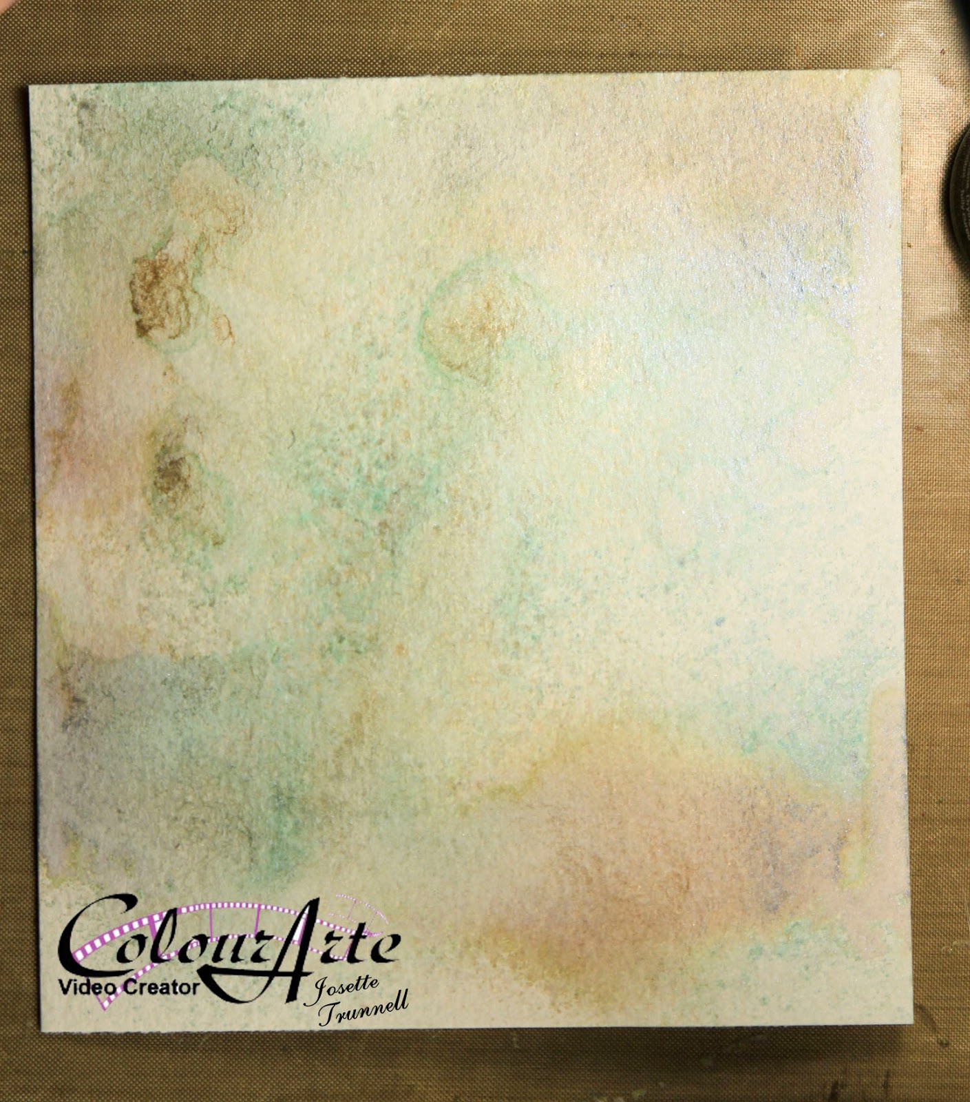
After the center image was painted, I used a heat tool to dry the image.  Then added water to the background and floated a blue around the outside.  Adding more water as needed to obtain a nice color wash.
Closer view of the painting.  See how the embossing is showing up as white lines.  

I thenspattered the image with a darker green and die cut into a circle.  Here you can see the embossing better. Note that the color is not staying in the lines.  This gives it a more painterly appearance.  

Ok, now to finish the card:  Using the same 3 sprays: Water Cooler by Calico Studio and a Green and Gold by Heidi Swapp,  a white cardstock, commercial paper doily and beige seam tape were sprayed.

I use a card board box to contain the misting.  The background was cut down to size and the best part of the ribbon selected for the card and the remainder tied into a bow.

All that is left is to add a mat in gold, a few embellishments and a card base.

The doily is placed on the card front and adhered with score tape.  The metal embellishment has also been attached with score tape and then the card base is layered on to a Gold Mat.
Watercolor paper can be tricky to get to stick. The paper often warps or the texture makes it hard to get a good contact.   I find that using score tape and fun foam for dimension will keep everything in place and it will survive even the USA mail. 
The bow and a metal tag completes the picture.  I did not add a sentiment so it will work for about any occasion.  I will add the appropriate sentiment to the inside of the card, thus allowing the art work to take center stage.  

Finished!!  Hope you enjoyed this final installment of Embossing.  Next month I will pick a different technique to focus on so stay tuned.  If you have any suggestions please leave a comment and let me know what you would like to have me explore.  

Thank you Robin's Nest for this opportunity to share my blog with you.


Until next time,
Happy Crafting,
Josette

Links
Visit previous blog posting for more information on Embossing.  Also ColourArte YouTube Channel for a video on embossing and painting with Twinkling H20's, which are another form of watercolor.
Supplies:
Peerless Watercolors,
White Neenah 80# card stock for card front. 
Commercial paper doily, 5"
Gold Cardstock for mat, Cream for Card base.
Strathmore 400 series 140# cold Press Watercolor paper
Beige seam binding
Metal embellishment: Tim Holtz Ideology line
Spray Paint:  Water cooler by Calico Studio, Green Shimmer and Gold Shimmer by Heidi Swapp
Fun Foam
Score-tape, glue dots

Saturday, November 14, 2015

ColourArte Video Time: Reverse Stenciling, Butterfly Shadow Box

It is time for another project for ColourArte.  I love backgrounds.  If I could just make backgrounds I would be happy.  Backgrounds however, are nothing without the rest of the story.  So lets discuss the background as well as the finished piece.  This project's technique is how to Reverse Stencil with ColourArte Silks.
The Background
As with all techniques, there is a learning curve to get the right combination of products.  I tried stenciling first and then coloring the background.  While it worked, it lacked the depth of this example.  I tried various products as well.  Silks gave me the softest and most distinct image transfer.
Here are a few of the backgrounds that were created during my exploration of this technique:
This is the stencil using Radiant Gels and is done in the traditional stenciling manner.  Note the "gears" are the white space.  If you want the opposite from your stencil, this technique fits the bill.  I tried reversing this stencil, it worked but the finished product had a lot of texture but no distinct image.  Might work better with a different stencil.  This one had a lot of "plastic" to cover.
Another example, this one is using Silks and is reversed Stenciled in the same manner as demonstrated in the video.  Not bad, will use if for another project later.  To "bold for this project.  
Background prior to stenciling.  This was Water Color paper misted with a mixture of water and Primary elements.  I went with less concentration of color to give a soft background with areas of more intensity.
After I finished the background the challenge was to find a way to use it, so let see what I came up with.
The background supports the focal images without being overwhelming.
The flowers were misted and daubed with several Radiant Rain Products and Primary Elements.  

The ribbon was created by spraying and daubing Radiant Rain products as well as the same sprays used on the background to create a harmonious composition on Seam Binding.
Beginning of ribbon coloring.  Once the ink is laid down, water is added and then the ribbon is kneaded to blend and distribute the colorant.  I appears very bright and bold here, but once dried, matched the background very well.

The very back, background was made by spritzing the Primary Element spray through a texture plate by Gina Designs.
The ink was blotted up to give a faded distressed feel.  This wasn't necessary as most of it was covered with the focal background.  But is a good technique to use for another project.  
The most rewarding part of this project were these butterflies.  I had received a sample of Embossing Powders from Sweet Stamp.  I was playing with them when the idea came to me to include them over the background.  I was going to add gears and metal to make a steampunk project, but the idea of adding the butterflies to the gear background seemed right, Organic meets natural.  But I needed them to match my project.  I did not have any powder that matched.  After much thought decided to create my own.

I combined:  embossing powder fine detail, with chunky. Glitter, both fine micro glitter and Distress.  Distress Embossing Powder, Glittered Embossing Powder, plus some of the samples that I had received from Sweet Stamps.

Once embossed, they were further enhanced with the Emperor's Gold Silk and Radiant Rain Sprays.

Final step was to distress the background and apply ink to the edges and enhance the colors within the background.  I find that Distress Ink goes with everything!!
Distressed and ready for ink.  Tumbled Glass and Walnut Stain Distress.
Final product!!  Beautiful.

Link to YouTube: Watch the process

Hope you enjoy!!
Until Next time, Happy Crafting
Josette

Links:
Colour Arte:  http://colourarte.com
YouTube: ColourArte Channel

Supplies:
ColourArte
Radiant Rain:            Egyptian Gold Dauber
                                  Nutmeg Spray
                                  Guatemalan Dauber
                                  Teal Zircon Spray
Primary Elements:    Beach-House Blue
                                  Ancient Coin
                                  Burnt Umber
Silks:                         Emperor's Gold
                                  Olive Vine

Other Products used:
Strathmore 400 Series, Cold Press Water Color Paper, 140#
Distress Ink;            Tumbled Glass
                                Walnut Stain
Dies:                        Sizzix: Movers and Shapers butterflies , and Large Butterfly
Sweet Stamp:          Enchanted Aubergine Embossing Powder
                                Mermaid's Tears Embossing Powder
                                Piccolo Enamel/Embossing Powder adhesive

Products used to create embossing Powder mix:
Sparkle and Sprinkle: Opaque:  Candlelight and Mediterranean Star
Tsukineko:    Verdigris
Distsress embossing powder:       Walnut Stain
Distress Glitter:  Tarnished Brass
                            Peeled Paint
                            Peacock Feathers
Hero Arts:  Clear
Stamendous: Aged Gold, Aged White,