Showing posts with label flowers. Show all posts

Wednesday, February 17, 2016

Club Scrap: Challenge Card for "Can You Case It"

Today I am going to share a card that I created for: Can You Case It.
This weeks challenge is:
Purple, Kraft or tan, and white.  Well this months club kit is all about flowers and there was a gorgeous purple paper and cream colored paper in the kit.  Perfect!!  So off I went.  This was harder than expected.  I created many cards and none read as purple.  So for this posting I am going to show the only purple looking card that I was able to get to photograph as purple!

So, how did i create this?  If you follow ClubScrap Blog, you would know that Color Burst by Ken Oliver has been a hit over there.  I love pigment powders and had not tried this product so thought I would.  It is much harder to control the pigment and distribution with this product as the powder is so fine, but I did get a few backgrounds that I liked.  Trying to incorporate these busy backgrounds into a stamped project is a challenge so I chose to create flowers from he backgrounds.


I stamped the dahlia flower from the kit onto to background and cut them out.
Once finished I used a mica blend to fill in the centers.  I die cut some leaves from green paper and was ready to complete my card base.

First I made an A2 card base from Kraft that was top folded.  On a piece of white cardstock stamped stripes using the line stamp included in the Kit with Purple ink. I attached this to the bottom edge of the card.

Next, I cut a panel from the linen like paper that was included in the kit, and using a circle die, rounded the bottom.  This was placed over the stripes.  A sentiment was stamped and heat embossed with clear powder and attached over the stamped panel.  All that was left was to arrange the flowers and leaves.


Perfect card! Makes me think of spring.
All supplies are available through Club Scrap.
The stamp used was from the Weather Floral Unmounted Stamp Collection
I used Purple, Yellow, Red  and Blue Colorburst-Single-Colors .
Die cut for leaves, unknown.  I have an envelop full of random leaves from various manufacturers, most likely Spellbinders or Sizzix.  

Be sure and visit:  Can You Case It to see all the other cards made in this wonderful color combination.
Until Next time,
Happy Crafting
Josette

Tuesday, November 17, 2015

Flowers, Flowers and More Flowers, all from Scraps!!

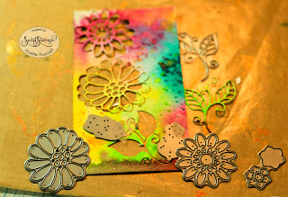
Hi, today I am posting on behalf of Sweet Stamps.  This is a fun card.  All made from scraps or failed background attemps.   Whenever I am creating backgrounds, I make several.  Some work and some do not.  Also when I am stenciling, or playing with paint or ink on my craft sheet, I use a left over pieces of Water Color paper to mop up the excess paint/ink.  I keep these in a container.  You never know when there might just be the right combination of colors for a project.

A tip:  When purchasing Water Color Paper, buy the largest size sheets available and cut it down to size. I buy mine at Hobby Lobby or Michaels when they have the sale, and then cut them up at once.   I cut mine at 5 X 6 or 5 X 7 and store them together.  I leave a few the width of the paper by 5" wide (5 X 11 or so).  It is more cost effective than purchasing them pre cut.  Cutting them up saves on space and saves on time when you "just need another piece".  At the end of the cut there is always a 2+/- strip, I put these on my work bench and that is what I use for "mopping up".

Ok here is the Card!!
The entire card, including the ribbon was made from left overs and scraps.  
The base is a piece of water color card that I had watercolored.  It came out to purple for the project so was thrown into the bucket.

The flowers were die cut using various dies from Sweet Stamps:  Visit their blog for links to all the dies and stamps.  Sweet Stamps Blog

Here is an example of one of the papers that came out of my bucket.  This was a spray, direct application, I am thinking it is either a delusion or Calico Studio.

This sample is a failed background.  The paint was left on my craft sheet.  The paint had been applied to a stencil.  When the stencil was picked up, I sprayed the remainder with water and laid down a piece of paper.  Too much water and it bled, not distinct enough.  But makes great flowers.  

I flip over the paper and applied a piece of score tape to the back.  Then when die cut, all the parts are sticky.  
Here is another piece of sprayed paper, score tape has been added to back side, and then the dies are cut.  
Closer view.
The next part was tedious.  Some of the inside petals were swapped out with another die cuts petals.  This is where the score-tape came in handy.  I picked up the petal from one with tweezers and placed it into a different petal, inlaying.  The Score tape kept everything together.  Some I only used the frames and discarded the insides of the petals.  

On 2, I needed to use an additional piece of score tape.  I cut it into a square and applied it to the back of the flowers.  When I was done, I just cut "close" to the flower, removed the backing and dipped the flower into Glitz glitter.  Burnished in.  This gave me a halo of glitter around the flower and took care of the stickiness.  
 The flowers were arranged onto the mat card, a ribbon, that was left over from another project, was added to the bottom.  I found a piece of left over cardstock that had been misted with a gold spray, stamped the sentiment in black, heat embossed with a clear embossing powder, die cut and popped it up on the card.  Final step was to mount on a card base.  This too was retrieved from my scrap bin so that I could say this was a 100% scrap-paper card.  

A different view.  This card was difficulty to photograph with all the glitter and gold paint/ink, but in person it is a show stopper.

Thank you for stopping by,
Happy Crafting
Josette


Other supplies:  Various inks and dies
Strathmore 400 series, 140# Water Color Paper, Cold Press
Glitz glitter
Score tape
Seam binding
Black Pigment ink and Clear embossing powder
.  

Saturday, September 12, 2015

ColourArte YouTube Video is live

Good Morning;
My ColourArte YouTube Video is live and available for your viewing pleasure.  It is also available on my YouTube Channel as well.  If you are viewing this via email: click the link to go to my blog for the video. 
ColourArte

I would like to take the opportunity to discuss the technique and share some additional examples of how to use this technique.  Then watch the video to see the process in action.  Be sure to visit ColourArte for all your sparking mediums.   In the future I will explore more of the product line, but for now, the focus is on Twinkling H2O's,

Finished Project
This card appears very complicated, but in fact is simple.  Chose an image that you desire.  Any will work.  I have used this technique on Animals, Scenes, Florals and some times very simple stylized images.  Most of those are better with direct stamping, but sometimes, that process can be too iffy and this is a good substitute.

The floral image in the video was stamped with a water soluble ink, like distress and then colored in with a thick to medium consistency of H2O.  It should be the consistency of a very fluid acrylic paint but not as watery as ink.  Half and Half, perhaps.  You can vary the consistency for where you are applying and for how transparent or opaque you want the image.
Stamped image, ready for painting.  Note the pots of paint that have been spritzed with water, lined up
Once filled in, the next step is to apply ink.  I used a Copic Multi-liner .25 mm in black for all my inking.  I use a very light hand and try for "sketchiness".  I don't want a harsh line or to have the image appear to have been traced.  Nor do I want it to follow the stamped outlines.  This is how you get it to appear as an individualized art piece.

Here are two examples of this technique being used with different images.  Both are animals.  The dog was stamped, colored with copic markers, then the inking applied.  The Cats were done with water color and then inked.

Water Color and Inked. Double click to view up close

This image was colored with copic markers, Then inked using a Copic .5mm Multi-liner, finally highlighted with a white gel pen.

Water Colored Bird house using direct Stamping and then inking with the Paint and a fine brush

The final photo is also of a watercolor, but this was done with direct stamping using watery Twinkling H2O's.  After stamping and allowing to dry, the image was enhanced with a very fine liner brush and paint that had been thinned with water to the consistency of ink (whole milk).  All of the "inking" was done with a paintbrush.  Just another idea to enhance your stampings.

Watch the video to see the entire process.
Don't forget you can find your Twinkling H2o here:  ColourArte

Thank you for stopping by!
Be sure and leave a comment about what you would like to see more of or less of.
Any suggestions for future topics are welcomed.

Stay tuned for more stamping tomorrow with a posting about Club Scrap and the new Kit.
Happy Crafting!
Josette


Tuesday, September 8, 2015

How to direct Stamp with Twinkling H2O's.

I have been busy creating my first project for the ColourArte Video posting.  It is a process with a very steep learning curve.  I had to fix my camera mount, lighting and work area to make filming easier.  After creating my test video, the deficiencies of my set up were apparent so I set about to correct this.  My current setup still needs work but thanks to my husband's help is coming along!!!

As a lead in to my first Video episode, I would like to share my test video and discuss why I chose to start with with this project.
Little pots of Wonder
Where to buy Twinks?  Click here
Thoughts:  I love Twinkling H2O's.( Where to buy Twinks?) They were one of the first purchases I made as a new crafter.  The lure of a sparkle in a water color was too much to resist.  I bet you all have those amazing little pots of wonder in your stash!!  Do you use them?   If you are like most, the answer is NO.  The why of this has always puzzled me, but then I remember my first experience using them and understand why.  But I would like to encourage you to get them out and play.  I hope these videos will inspire you.

When I started to pursue being a design team member, my first objective was to educate.  Where better to start than with Twinkling H20's.

Let's start with a few guidelines to get you started into exploring Twinkling H2O.
Always begin by laying out the colors you are planning to use and then spray with water about 5 minutes before you start.  How much water is very subjective.  I generally just spritz to start the activation and then add water based on how quickly the  water is absorbed.    I generally like them a bit thick and will  dilute later if needed .  The more you use them, the less water it takes to activate them.  Final step before painting and a very important step is to Stir.  Most forget this  step or don't realize that it needs to be done.  These have mica in them and the mica needs to be distributed into the paint so that you get a nice even glimmer or shine.  Many times I hear that "they are too dull" or very transparent.  These simple steps will help solve these issues.  1) spray with water 2) let sit for 5 minutes and 3) Stir.
Now that you have the basics down,   join me as we explore various uses and techniques using Twinkling H20's.

The projects: The first project with Twinkling H20 is direct stamping.  This is a very easy technique to master.  You can achieve a painted appearance or a water color appearance, by just adjusting the water and consistency of the paint, or spritzing the painted stamp prior to stamping.  


combination of techniques, but all were direct stamped.
These were all done with the same process.  Only difference was the addition of water.  The Twinkling H20 directly applied to the stamp, stamped and then doodled around the image to give it an inked appearance.  Final step was splattering with pain and mounting it onto the card.  Enjoy the video as I go through the steps
Very thick application of paint, very little water


Direct Stamping with Twinkling H20

On Saturday, September 12, my second video with Twinkling H20 will premier on ColourArte's YouTube Channel.  Remember to check back here for links and information.  You can also subscribe to  ColourArte's You Tube Channel.  Then you won't miss an episode of my creations or tany of t he other team members projects.

Don't forget to subscribe to my blog, so you will stay updated on all of the exciting projects from ColoruArte and Club Scrap, as well as my own creations.

Happy Crafting,
Josette

Wednesday, May 13, 2015

A Latte For You!! Finished!!!

Well I finished my canvases.  The first part of the video has been posted to You Tube, unfortunately, my dear MacPro decided to have a hissy fit and is at the computer doctor as I write,  awaiting the verdict as to whether the condition is terminal or nearly needing a fix.  I sure do hope it  is not terminal.  Photoshop was my demise last night.  I swear that thing is a memory hog and froze my beloved computer, all decked out in Vera Bradly to a grinding halt.  They no longer make a 17" MacPro and Vera no longer makes skins!!  Well there is no hope moaning, it is what it is, all things reduced to silence by techno seizure.  Well at least I have a camera and I would love to share my photographs of my finished canvases.  These have not been photo shopped, or enhanced in any way, since my Mac contains my only copy of Photoshop and I am too lazy to try and learn another program on a PC.

In the process of creating the videos, I made 2 full canvases and part of a third.  The second one is clearly better as I had the opportunity to correct what I thought could be improved upon, but both are worthy of becoming decorations.  My next task is to use the same idea and create a card, so stay tuned.!


The top canvas is the last one and the second canvas was created first.  They have the same layout, same colors, but slightly different sizing of the cups and coffee bean and a different sign.

I am quite proud of the coffee bag on the second canvas, looks like it is going to have the beans spilling out.  The First one is more true to the actual stamp


Here are close up of the signs.  These were created by applying foil over a chip board label that had chip board letters glued onto itl.  The letters were embossed, and then the item was textured using various tools..  Finally there was  layering of alcohol inks, Inca Gold and Rub and Buff   Looks like metal or maybe a distressed wooden sign.  

Also in these photos, there is a good close up of the "whip cream".  This was created by adding layers of different medium applied onto velum.  The first step was coloring the shadows with  water colored pencils and then the medium applied over. This is more apparent in the first photo (Latte).   The white Foam is created by using irIsisible Texture spray, not sprayed, but dabbed on allowing it to pool in the folds created when the vellum is wet.  There was a second medium applied, after the watercoloring that helped "fix" the folds and convolutions into place.  
I love Mixed Media Art and will making more of these whimsical canvases over the next few months..  Any suggestions as to theme? 
Don't forget all products are available at     http://www.flossyscrapper.com.
 I am not sure how to link the You Tube video in this blog, but will post as a separate posting following this one.  Let me know what you think about the video.

Supplies Used
Prima Flowers for color theme: Bedtime Story
Acrylic Paint: White, light blue and turquoise, blended to match the Prima teal flower.
Ranger textrue Paste
Tim Holtz Stencil: Lace TH5034
Heidi Swapp Stencil: Stars and dots
Distress Stain Worn lipstick Peacock Feather
Distress Paint: Barn Door Spiced Marmalade Mustard Seed Wild Honey, left this out of the narration
Stamps: Stamper's Anonymous: Freshed Brewed Blue print Circle stamp for label on cup
Paper Kaiser Craft Hello Today 6 x 6 Vellum, cream or vanilla colored Scrap of Kelly Green Cardstock for straw
Plastic lid from Starbucks
Stickybacked canvas: Ranger
Ranger Black Archival Ink or Staz-on
Faber Castell Pitt Pens Assorted browns and greys, plus black
Prima: 3D Gloss Gel
Art Anthology: Sorbet Dimensional Paint (for first layer of whipped cream.
Ranger glossy Accents
Chipboard label or cut a label from chipboard
Chipboard alphabet
Ranger: Foil Sheets
Prima Water Color Pencils
Liquid Pearls: White Opal
Ranger Alcohol Inks, various colors
Inca Gold Gold, Silver, Copper and Black
Heidi Swapp: Gold color shine
IrResistTible: Texture Spray, Wedding Dress
Until next time, Happy Crafting!!
Josette


Friday, May 8, 2015

Happy Mother's Days, Some thoughts and a preview (again)

Well here we are at Mother's day weekend.  How does time fly.  I have been working on my video for Flossy Scrapper.  Not as easy as it seems.  Each canvas takes about 3 days.  Drying between layers works better for me than speed drying.  I needed to make 2, one to work out the process and the other one to be made during filming.  And a third one for all the times the camera stopped, or I got out of view at times.  I must say, this video is not going to win any awards, but it does get the job done.  It also gives me an appreciation for all those souls that make and regularly broadcast their creations on You Tube, You rock.  So in this blog post, I am showing a sneak picture of the finished and nearly finished canvases.  As soon as the video is uploaded to You Tube, I will post here as well.   Come back soon and check it out!!!


The one created in the video is even better.  But I will save that image for the next blog post.  The signs are interesting and I will include a close up as well.  I used chipboard that was die cut from a sizzix label die, chipboard letters were then glued onto this.  Then I covered the letters and label with foil tape, embossed the foil around the letters, added texture and finally colored.  While it is difficult to see in these photos, it has the appearance of an aged metal sign.  I will be taking photos with my "good camera" not my iphone for the postings that will accompany the video.  But thought you would like a preview of the final project. The final has gold highlights, glitter, pearlized steam.  None of which are evident in this photo, but wait for the next posting!!! 

I had  a revelation while editing the video.  I noticed with amazement,  how much my hands and the movement of my hands, reminded me of my mother.  At first it made me miss her and I was very sad that she not here.  But with  the sound off and with continually watching "me" make this canvas, over and over as I edited, that sadness was replaced by total amazement that we were so similar in our actions,  This lead to reviewing my life with my mom  and  I took a meandering trip through my memories,   I was able relive  all those times when I would watch her with her crafts or cooking dinner, or just being a mom..  It made me miss her,  partly made me sad that I lost sharing my "art" with her, but happy that I had those memories and grateful for the time we did have.  I know that she would be smiling, knowing that I enjoy crafting as much as she did.  Happy Mother's Day Mom, wish you were still here with us.  
s  So until next time, Happy Crafting!!!

Wednesday, April 1, 2015

Day 2 another card!

Today's card is interesting.  I was trying to water color flowers and this one came out dark and "fall like" not spring at all, which is what I was going for. The stamp is Straw-flowers, from Technique Tuesday,  I did have success in creating a spring flower with a later attempt, using  a different stamp, and a different set of water colors (will post that later),  but I needed to do something with this one, but what?.

I had a template for a swing card,   I had received a similar one in a kit at the Journey Coach meeting in March.  So I decided to try one on my own and only usea circle die.  All the papers were cut to fit, after I had the swing card base build.  I went with an antique or vintage theme.  I feel like it worked out well and "lightened it up at bit", not so dark and fall like, but still not spring!

I learned a lot about water coloring.  What works and what does not work in regards to paper selection and types of ink that work for water coloring.  In the end: I used Canson paper water color paper, 140# cold press, stamped in distress ink , pumice stone and water colored the image with  Peerless Watercolors.  After the main focus was completed, the background was inked in distress ink that had been  diluted and then was sprayed on (blue) and brown was dabbed on.  I believe these were tumbled glass and brushed corduroy.  One thing I like about distress is that when wet they produce a multicolored effect.  After drying, I  outlined with a copic multiliner and splattered ink spots using the same distress inks plus black soot.  I am not sure the title of the paper pack I used  as the cover and identifying marks are long lost, but I in know it was graphic 45.  Anyway, enjoy this "spark" and will post another soon.